

We are often surprised by how things change at a speed that surpasses our ability to learn and to understand the world.
The same is true in hotels. An average hotel today will have data on average from 6 or 7 different data sources. Often this data is very granular and contains hidden gems for decision making. This data is very diverse though.
Just taking the PMS data one can analyze such diverse dimensions such as market segmentation, channels, room types, source markets, and rate codes. Add to this length of stay for every dimension, lead time, stay patterns and then boil down every dimension to net revenue for past and future on the books and things start to get complicated. After filtering down to all these dimensions, slicing the data extensively and adding data from external data sources often one can forget what he was looking at in the first place. This is highly time-consuming and not efficient.
In today’s digital world where speed is the name of the game, this is simply not the best way to do business.
Fortunately, science has provided a way to help to consume large amounts of information.
Data Visualization
Data Visualization is a set of techniques, which allows everyone in the company who requires useful information for his own area to obtain immediate value from data.
Visualization works fantastically well from a human perspective. We process visual data better than any other type of data. In fact, the human brain processes images 60,000 times faster than text, and 90 percent of information transmitted to the brain is visual.
All this beats the old saying is that a picture is worth 1000 words. In reality, it is 60000 words.
Data visualisation can be defined as the visual / interactive exploration and the graphic representation of data of any size nature and origin. It enables trends, which seem invisible at a first analysis, to be identified.
A team of neuroscientists from MIT has found that the human brain can process entire images that the eye sees for as little as 13 milliseconds. Yet the Industry is still to a large extent using excel for Revenue Management or Business Intelligence.
The human brain doesn’t work as a computer and is unable, for example, to quickly parallel process the different data points generated in a hotel. At Juyo, we believe that without any doubt data visualization will play a crucial if not central role in interpreting data in the years to come. How to choose the right solution though?
Top considerations when opting for a Hotel Analytics and Visualization Software
1. Interfaces
Good decision making starts with good data. And good data starts with good Interfaces. Make sure that the company you work with has certified Interfaces with the different property management systems and with all external data sources. Cleaning the data and modeling it is a lengthy and detailed process. A company that has deep experience in Interfacing with hospitality vendors and diverse data sources has a head start. The cost of the project will significantly drop if this is the case.
2. Knowledge of the hotel industry
This is a must. It is of no use to reinvent the wheel and to build everything from scratch. There are no 10 ways of looking at booking pace. However, there are a lot of nuances from what perspective you can look at it. For instance, one would look at the evolution of booking pace instead of looking one static image.
3. Granularity of data
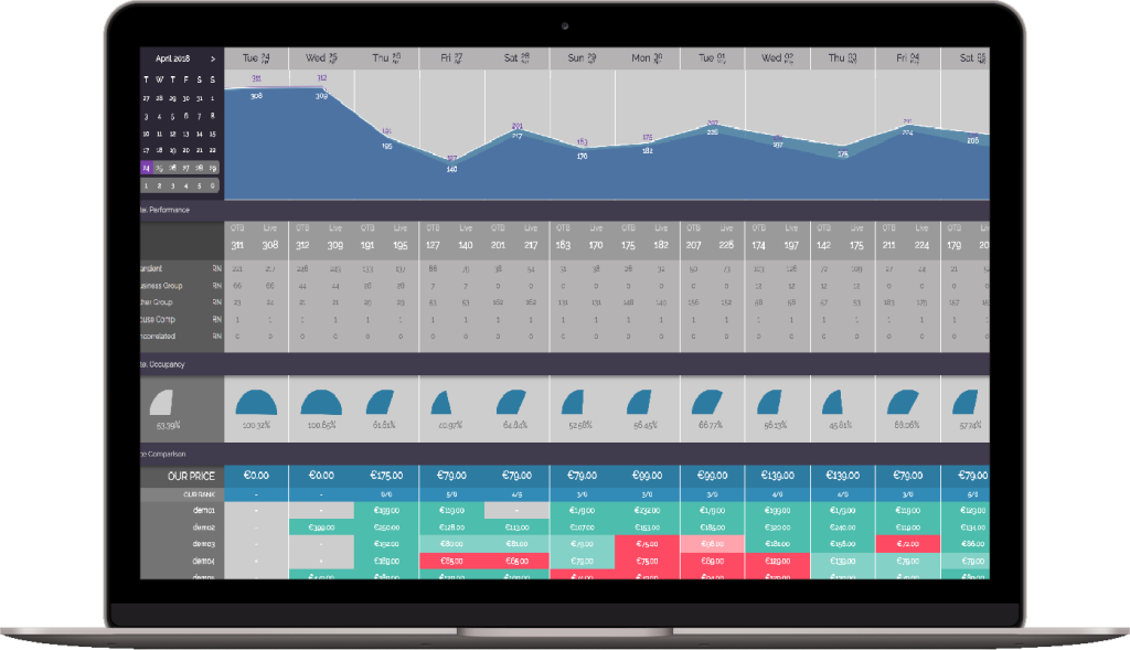
A robust visual analytics platform will capture data at the transaction level. Capturing data at the transaction level means that any user will be able to gain insight on segments, channels, rate codes, length of stay, lead time and many more dimensions.
4. Flexibility
Data in hotels are often in siloes. But value comes by combining different data sources. For instance, one can gain a deeper understanding of competitive pricing by combining prices and reviews. Net revenue on channel level can be combined with data from TravelClick Demand 360 giving insight into opportunities to capture more profitable business. And Google analytics data can be combined with bookings data by creation date to identify if we are building our future pipeline efficiently. The sky is the limit.
5. Ease of use
A visual analytics platform should be easy to use for anyone without technical knowledge. Dashboards should be able to be created in maximum 3-4 clicks. This will not only save a huge amount of time but also ease pressure on IT departments to create specific reports.
6. Visually pleasing
Creating beautiful visualizations is both science and art. It is a delicate balance of relaying the right insights to the users and being visually pleasing. It is extremely difficult to design the right data story when using a generic self-service tool such as Tableau or Power BI. Creating a visually compelling data story with the right context and dimension in data is Art. And the truth is we are not all artists.
7. Agile partner
Every organization has a particular DNA and way of working. That also means that every organization might look at data in a slightly different way or specific KPIs might be critical to track. This is often overlooked and often becomes an issue as organizations grow and needs evolve. That means that one should consider whether the platform has been built in a way that customization is feasible. Furthermore, is the partner company open to help with more custom requests? Is there a track record to prove it?
8. Powered by A.I.
Data Visualization is not only about designing beautiful dashboards. Extracting the right insights from vast amounts of data, making predictions about how the business is developing or personalizing the user experience is equally important. At the very least your partner should have a plan of incorporating AI to make data smart.
9. Putting the user first with design thinking
Design Thinking is an iterative process in which we seek to understand the user, challenge assumptions and redefine problems in an attempt to identify alternative solutions that might not be instantly apparent. The process should enable to design a user experience that merges the user’s workflows with actionable insights, suggestions, predictions, and next best actions to take for the decision at hand. Savvy business users will still be able to drill into the data and discover patterns and anomalies, but they won’t be burdened with the overly complex and expensive tools that are used by dedicated business analysts.
You can read the full original article, here.
Article written by Vassilis Syropoulos, Founder and CEO of JUYO Analytics.